The controversial rebranding of Ukrposhta could cost up to UAH 150 million and end up in court
6 February 10:57
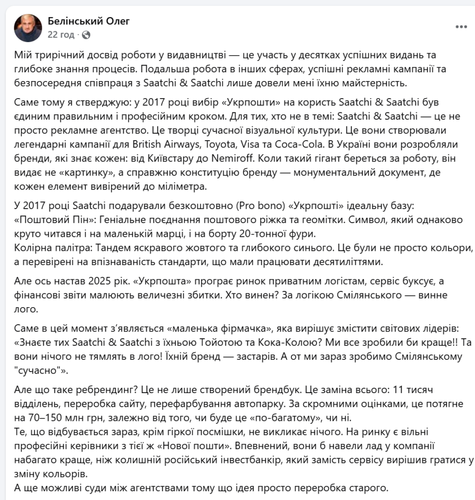
The new rebranding of Ukrposhta could cost the company between 70 and 150 million hryvnia and lead to legal disputes between agencies. This was stated by entrepreneur Oleg Belinsky, who harshly criticized the intention to change the current identity, created in 2017, according to "Komersant Ukrainian".
According to him, the current situation looks like an attempt to shift the company’s systemic problems onto an “outdated logo” instead of putting the service and management in order.
Why the 2017 brand was considered the benchmark
Belinsky recalled that in 2017, Ukrposhta chose the global network Saatchi & Saatchi for its rebranding, and this choice, according to him, was unambiguous and professional.
“Saatchi & Saatchi is not just an advertising agency. They are the creators of modern visual culture. They are the ones who created British Airways, Toyota, Visa, Coca-Cola. In Ukraine — from Kyivstar to Nemiroff,” Belinsky emphasizes.
He emphasizes that the agency did not create just an “image” for Ukrposhta, but a full-fledged brand system — and did so pro bono.
“When such a giant takes on a job, it produces not a logo, but a real brand constitution — a monumental document where every element is calibrated to the millimeter,” the expert notes.
“Postal Pin” and colors “for decades”
Belinsky names the “Postal Pin” symbol and the yellow and blue palette as the key elements of the 2017 identity.
“The ‘Postal Pin’ is a brilliant combination of a postal horn and a geotag. It’s a symbol that looks equally cool on a small stamp and on the side of a 20-ton truck,” he explains.
According to him, the colors were also chosen deliberately.
“It wasn’t just yellow and blue. These were standards, tested for recognition, that had to work for decades,” says Belinsky.
2025: rebranding as an “explanation of losses”
The expert emphasizes that in 2025, Ukrposhta will lose the market to private logistics companies, the service will be criticized by customers, and financial indicators will remain negative. In this situation, the expert believes, management is trying to explain the problems not with management and service, but with an “outdated logo.”
“Ukrposhta is losing the market, the service is stalling, and the reports show huge losses. And according to the logic of the management, suddenly the logo is to blame,” Belinsky says ironically.
He also does not hide his criticism of Ukrposhta CEO Igor Smelyansky.
“Instead of focusing on service and processes, they decided to play around with changing colors,” the expert notes.
How much does rebranding really cost?
Belinsky emphasizes that rebranding is not just about creating a new logo or brand book.
“Rebranding means replacing everything: 11,000 branches, the website, digital services, repainting the vehicle fleet. These are not minor details,” he emphasizes.
According to his estimates, the minimum cost of such changes is UAH 70 million, and on a full scale — up to UAH 150 million.
“And that’s still a question of whether it will be ‘lavish’ or ‘minimal’,” adds Belinsky.
The risk of lawsuits and accusations of copying
Another serious risk is possible legal disputes.
“I do not rule out lawsuits between agencies, because what is currently being offered looks like a reworking of an old idea,” says the expert.
“The problem is not with the brand, but with management”
In conclusion, Belinsky makes a harsh conclusion:
“There are professional managers available on the market from the same Nova Poshta. They would put the company in order much better than the former Russian investment banker who decided that the logo was the main problem,” he concludes.
The expert is convinced that without systemic changes in management and service, no rebranding, even the most expensive one, will save the state postal operator.
This is the fourth major branding change in the company’s history, and, as Ukrposhta emphasizes, it is meant to symbolize the completion of internal transformation against the backdrop of a full-scale war.
From “pina” to the letter “U”
The main visual change was the return to the classic postal horn. In the new brand, it took the form of the letter “U” — the first letter of the word “Ukraine.”
Thus, the company abandoned the geolocation symbol (“foam”) it had been using since 2017 and focused not on physical presence, but on meaning and connection with Ukrainian identity.
Ukrposhta explains that the war has shown that being “everywhere” is not a slogan, but a daily mission to stay close to people even in the most difficult conditions.
How the Ukrposhta brand has changed
The company notes that each change in identity reflected a certain stage in the development of the state:
- 1992 — a post horn as a symbol of the formation of the Ukrainian postal service;
- 2009 — a flying envelope and a focus on speed and modernization;
- 2017 — a horn and a “pin” with the message “Ukrposhta is everywhere”;
- 2026 — a return to Ukrainian meanings and cultural code.
Ukrainian typography and colors
The designers brought back the classic combination of blue and yellow and created new fonts inspired by the history of Ukrainian postage stamps.
According to the Spiilka Design Büro team, the typography refers to different periods of Ukrainian statehood — from the stamps of the Ukrainian People’s Republic and Pavlo Skoropadskyi’s Hetmanate to the works of Heorhii Narbut. In this way, they are trying to embed a recognizable “visual voice” of the Ukrainian postal service in each letter.
Where will the new brand appear?
The updated identity will be implemented gradually — in digital and physical channels:
- in the Ukrposhta app;
- at post offices;
- on new vehicles;
- on employee uniforms.
At the same time, the old brand will remain on some signs and advertising media. The company explains this by its desire to avoid additional costs for a complete replacement of the identity.