Ukrposhta changed its brand: how much did the rebranding cost and what did the company gain?
2 February 18:10
On its 32nd birthday, February 2, the state-owned company Ukrposhta presented its updated brand. The Ukrainian team Spiilka Design Büro worked on the new identity, creating a new visual language for the national postal operator. This was reported by the postal service’s press service , according to "Komersant Ukrainian".
This is the fourth major branding change in the company’s history, and, as Ukrposhta emphasizes, it is intended to symbolize the completion of internal transformation against the backdrop of a full-scale war.
From “pina” to the letter “U”
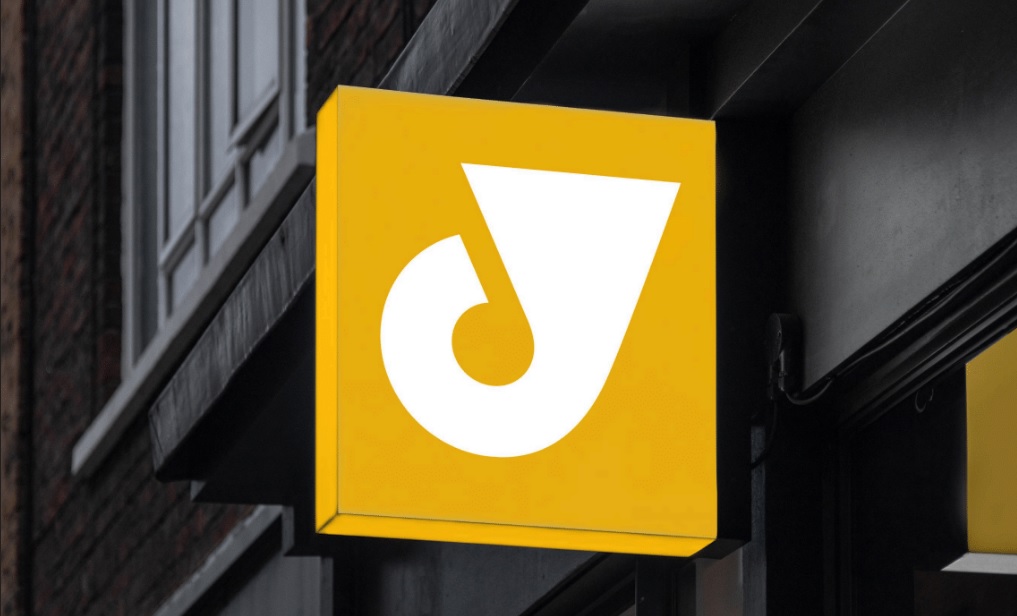
The main visual change was the return to the classic post horn. In the new brand, it took the form of the letter “U” — the first letter of the word “Ukraine.”
Thus, the company abandoned the geolocation symbol (“foam”) it had been using since 2017 and focused not on physical presence, but on meaning and connection with Ukrainian identity.
Ukrposhta explains that the war has shown that being “everywhere” is not a slogan, but a daily mission to stay close to people even in the most difficult conditions.
How the Ukrposhta brand has changed
The company notes that each change in identity reflected a certain stage in the development of the state:
- 1992 — a post horn as a symbol of the formation of the Ukrainian postal service;
- 2009 — a flying envelope and a focus on speed and modernization;
- 2017 — a horn and a “pin” with the message “Ukrposhta is everywhere”;
- 2026 — a return to Ukrainian meanings and cultural code.
Ukrainian typography and colors
The designers brought back the classic combination of blue and yellow and created new fonts inspired by the history of Ukrainian postage stamps.
According to the Spiilka Design Büro team, the typography refers to different periods of Ukrainian statehood — from the stamps of the Ukrainian People’s Republic and Pavlo Skoropadskyi’s Hetmanate to the works of Heorhii Narbut. In this way, they are trying to embed a recognizable “visual voice” of the Ukrainian postal service in each letter.
Where will the new brand appear?
The updated identity will be implemented gradually — in digital and physical channels:
- in the Ukrposhta app;
- at post offices;
- on new vehicles;
- on employee uniforms.
At the same time, the old brand will remain on some signs and advertising media. The company explains this by its desire to avoid additional costs for a complete replacement of the identity.
Company transformation and financial issues
Ukrposhta emphasizes that the rebranding was the logical conclusion of several years of internal transformation. During this time, the company has automated its sorting lines, achieving 95–98% on-time delivery, launched the Ukrposhta 2.0 app, expanded its network of parcel terminals, and updated its vehicle fleet, despite the war.
At the same time, the rebranding is taking place against the backdrop of a difficult financial situation. At the end of 2024, Ukrposhta ended the year with a net loss of over UAH 413 million.
The procurement of services for the rebranding was announced in June 2025 through ProZorro. The initial expected cost was over UAH 1.2 million. In July, the company signed a contract with designer Anastasia Zherebetskaya for approximately UAH 640,000. At the same time, a cheaper offer from another company was rejected.
Ukrposhta itself does not comment in detail on the financial aspects of the decision, emphasizing primarily the symbolic significance of the new brand.


