Instagram Became “Instagzam”: Why the New Design Sparked Controversy
14 August 07:40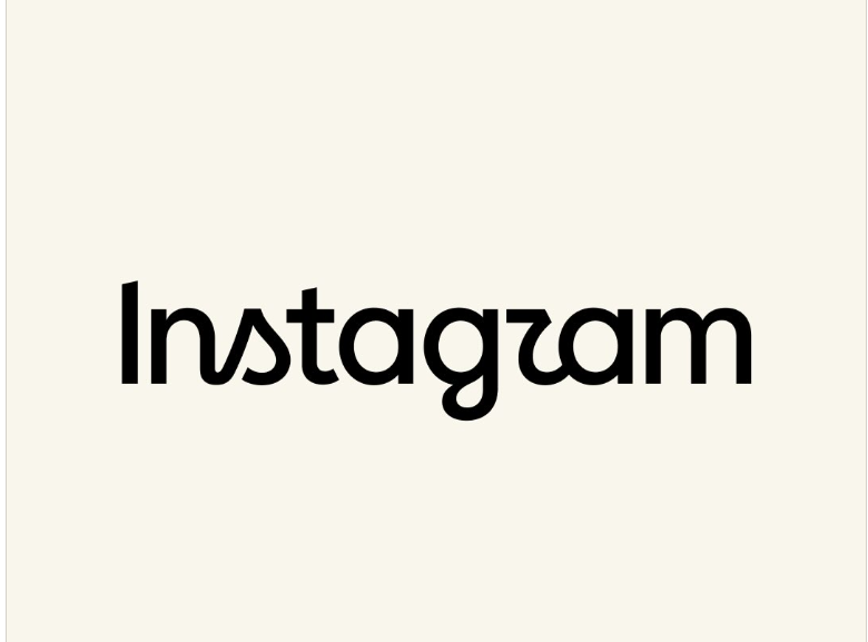
For the first time in ten years, Instagram has changed the official spelling of its name. The familiar gradient app icon remains unchanged, but the new font has already become a source of jokes: some users misread the name as “Instagzam,” according to "Komersant Ukrainian"
Instagram has unveiled an updated text logo— a wordmark consisting solely of the social network’s name. Users can see it, in particular, at the top of the app.
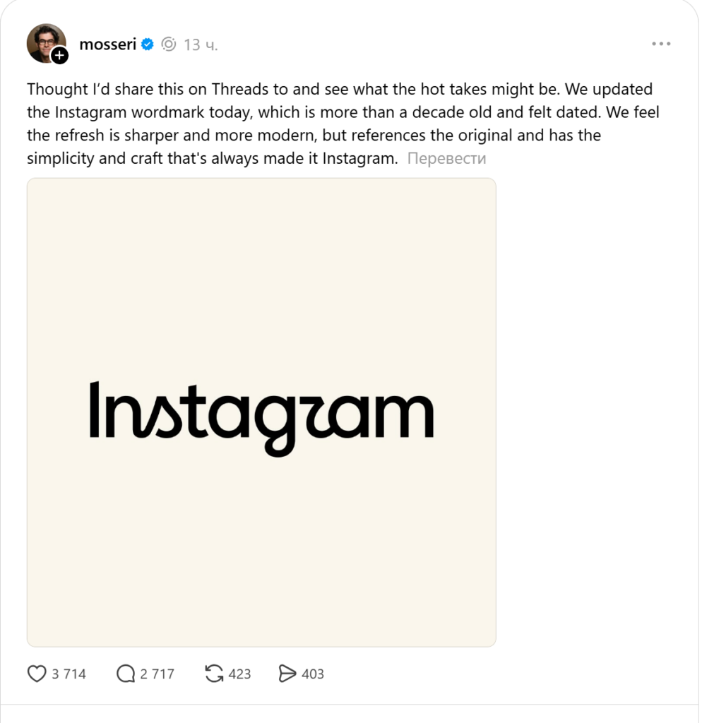
Instagram Head Adam Mosseri announced the redesign. According to him, the previous text logo had been in use for over ten years, so it began to look outdated.
What exactly has Instagram changed?
The update does not affect the familiar square icon featuring a camera and a pink-to-purple gradient, but only the “Instagram” text.
The new text logo combines elements of print and handwritten fonts. The letters have become sharper, and certain characters—specifically the “s,” “r,” and “g” —now feature distinct curves.
The company believes that the new lettering has a more modern and cleaner look, while still maintaining a connection to the previous brand identity.
Why the New Logo Was Called “Instagzam”
The letter “r” raised the most questions among users. Due to its unusual curve, some users mistook it for a “z.”
As a result, people on Instagram and Threads began joking that, following the redesign, the social network’s name is read not as “Instagram” but as “Instagzam.” The Verge also highlighted issues with the readability of the new font.
At the same time, Instagram remains such a recognizable brand that most people understand the name regardless of the shape of individual letters.
Watch us on YouTube: important topics – without censorship
How Users Reacted to the New Logo
The audience’s reaction was mixed. Some users called the new logo fresher and more modern, while others found it less distinctive and harder to read.
Some commenters also asked why Instagram is spending resources on a redesign instead of improving algorithms, monetization, and content moderation.
Mosseri himself, while presenting the update on Threads, invited users to share their impressions. This suggests that the company anticipated controversy surrounding the new design.
According to TechCrunch, despite the criticism, the new typography has also received positive feedback—particularly for maintaining consistency with the previous font.
When Instagram Last Changed Its Design
The previous major update to the brand’s visual identity took place in 2016. At that time, Instagram moved away from the realistic brown camera with a rainbow stripe and adopted a minimalist icon with a bright gradient.
The text logo, which had been in use for about ten years with minor adjustments, was also updated during that same period.
The current redesign is much less extensive. It does not change the social network’s features, terms of use, or how its algorithms work. It is solely an update to the visual identity.
Meta has not yet announced the new Instagram icon design. Therefore, the gradient camera icon on users’ smartphones will remain unchanged.
Read us on Telegram: important topics – without censorship